When I say bright I mean very bright!! Bright vibrant yellow and white to mix with my greens and the galvanized French flower buckets.
I have already reviewed my past table settings and I also visited the idea of using soft to medium valued pinks.
Now I am going to visit the idea of a wonderfully bright and vibrant yellow!!
Let me show you some of the images in my inspiration files…………………
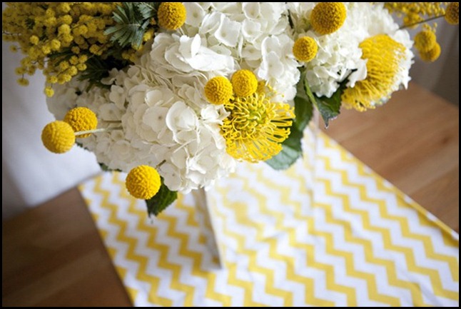
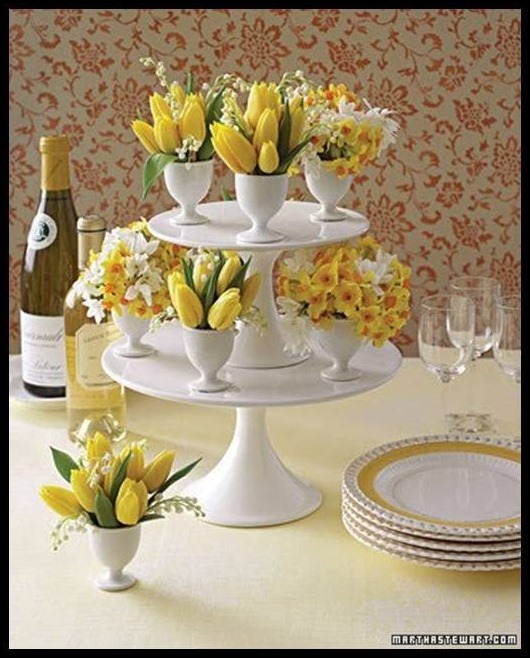
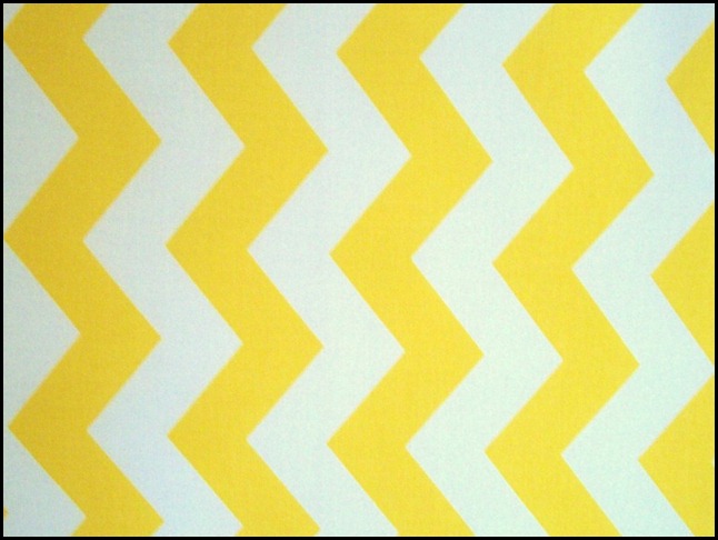
It all started when I saw this image!
I love the brightness of the yellow and white. The table runner reminds me of the rick-rack my Mom use to put on my dresses at Easter time. I am now on the hunt for this fabric!!!
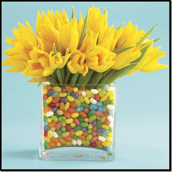
I love when one flower is used in mass like this. The jelly beans make this so fun and festive. I wonder if my sweet hubby would mind helping me pick out the green, white and yellow jelly beans? The other colors will just not work in my color scheme of yellow and white. What else is a girl to do?
Nobody can do an Easter table setting better than Martha Stewart, she gets it right every time.
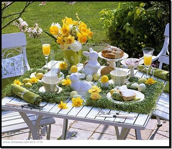
Such a cute idea to grow alfalfa for place mats. See how pretty yellow,white and green look together. Now just add a French flower bucket in there somewhere and we are in business.
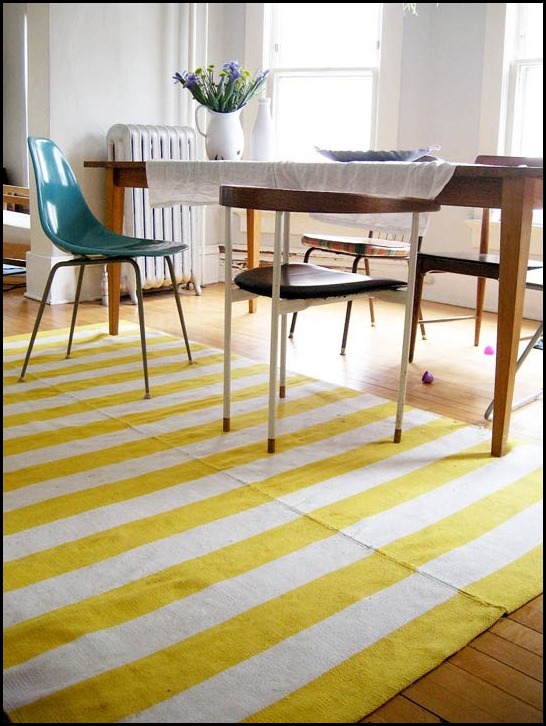
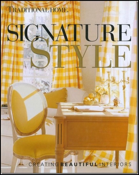
Gingham checks would be great for a tablecloth!!
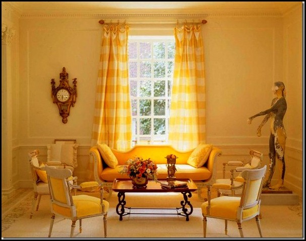
Love love this idea!!!
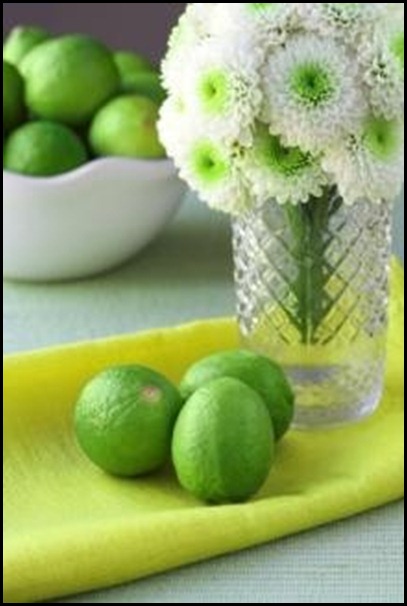
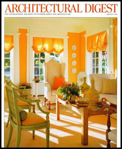
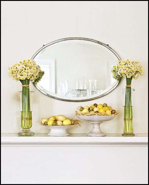
These are images that I am really attracted too. When I look at images like these above, I look for their use of not only colors, but there use of scale, texture and shape. I might just glean one element out of the image that will inspire me to do something similar or totally different, but with the same feeling that will apply to my tablesetting.
We have visited the idea of the soft to medium valued pinks and now the bright yellows and whites. My next step is to come up with the elements that would work well in both applications and somewhere in this process I will lean more towards one over the other.
I am such a visual person I can see pictures in my mind’s eye. It is not to say that I won’t tweak my original idea along the way. That is just part of the creative process.
I once read a something that a designer said that has always stuck with me. He said, “There are no mistakes in the design process only opportunities to become more creative!!” I am paraphrasing here but I think it so true.
So come back and see what my next step will be!!!!
“Enjoy the Process” Of:
Looking at several color schemes
for your design plan.
Kathysue

